Jimmy3Putt
KooL
- Messages
- 5,769
- Reaction score
- 6,684
Anyone else notice the "incognito" Sparty on the construction worker's hard hat?
WTF is up with that???!!!!?????
WTF is up with that???!!!!?????

Anyone else notice the "incognito" Sparty on the construction worker's hard hat?
WTF is up with that???!!!!?????
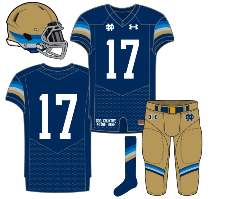
https://www.18stripes.com/notre-dame-football-uniform-concept-irish-whiskey-sunrise-2017/
These are better than the last ones, but I think they could have done without the stripes on the helmet. Also, not sure about the gray stripes.

Anyone else notice the "incognito" Sparty on the construction worker's hard hat?
WTF is up with that???!!!!?????
Simply putrid.
Had my GA's brought either of those concepts to me, I'd have fired them on the spot.
Agreed.
Don't like 'em, wouldn't want 'em, but they are IMO better than those white ones from last week.
If a GA of mine brought the white ones to me, I'd take them to a local Vet and have them putdown.

If a GA of mine brought the white ones to me, I'd take them to a local Vet and have them putdown.

Genuinely curious what you don't like so much about the first all-white concept?
But more so, how that can be considered putrid yet you think this looks good:
Taste is taste and everyone can be different, but damn I need some answers! In the Uni Watch community you linked to some of the worst black uniforms ever.

Rule #1 in advertising graphic artistry is you don't put yellow on white unless it's trapped with a border. The helmet is horrid. The dome doesn't make for a good logo anyways.

Rule #1 in advertising graphic artistry is you don't put yellow on white unless it's trapped with a border. The helmet is horrid. The dome doesn't make for a good logo anyways.
Just because I posted the All Blacks doesn't mean I'm a fan. I did it as a public service. I personally would like to see a Blue/Green combo with gold/white accents using the flag below as a template or an all chrome green scheme including chrome green helmet.
Perhaps the greatest logo in American advertising history disagrees with that rule. ND fans not liking the dome is fine. A little odd IMO but that's okay.
I think the blue/green dominant color scheme is alright in small doses. The softball team has (had?) a uniform with this scheme that's pretty well done. Although a football uniform offers some bigger challenges.
I don't think he said he doesn't like the dome, just that it doesn't make for a good logo. I can see where he is coming from. It's an odd shape for a logo, and is hard to pull off. Doesn't seem to fit well on the side of a helmet with the proportions.
Luckily the helmet represents the dome.
I know that's what he meant. I'm sure no one actually dislikes the dome itself.
But, the school has a couple really well designed dome logos that are great. I don't really understand the odd shape of it, in fact just the opposite. It's perfectly well proportioned and recognizable. If we're talking odd shaped logos maybe the leprechaun I would understand!
Yellow on white just isn't a good idea. I refunded/credited millions of dollars because of yellow on white design mistakes.
See what I mean? ^^^
BTW, are you saying McD's is the historical exception???

It's common sense to not create something people can't see. I'm not sure where you see a super bright yellow being used, nor tiny font.
The scheme used was that above, which is an officially liscenced monogram from the university.
I know that's what he meant. I'm sure no one actually dislikes the dome itself.
But, the school has a couple really well designed dome logos that are great. I don't really understand the odd shape of it, in fact just the opposite. It's perfectly well proportioned and recognizable. If we're talking odd shaped logos maybe the leprechaun I would understand!
Versus the same logo below which is not washed out, uses multi layer trapping and shadowing to captivate the eye? I'll take the pop. If you want to put kids in boring, poorly executed alt uni's while Oregon has the rest of the sport chasing them that's your position.
I actually really like it lol.
If they took the helmet stripes, made them straight, and angled them like the Navy helmets that are The Best Helmets of All Time, I'd be writing a letter to Under Armour supporting them as the next SS entry.


0 for 3
Looks like MTSU's unis.