
You are using an out of date browser. It may not display this or other websites correctly.
You should upgrade or use an alternative browser.
You should upgrade or use an alternative browser.
What is the "uniform surprise"?
- Thread starter ShamrockOnHelmet
- Start date
Sherm Sticky
The Prophet
- Messages
- 19,321
- Reaction score
- 1,638
You all are haters!
Except for the three or four of you who do like them.
I had an orgasm when I first saw the full SS uniform. My two favorite teams had sex and made a jersey.
I'm ordering my SS 2018 jersey now!
I'm still tingly thinking about the uniforms.
Except for the three or four of you who do like them.
I had an orgasm when I first saw the full SS uniform. My two favorite teams had sex and made a jersey.
I'm ordering my SS 2018 jersey now!
I'm still tingly thinking about the uniforms.
- Messages
- 19,128
- Reaction score
- 11,077
Plot Twist:
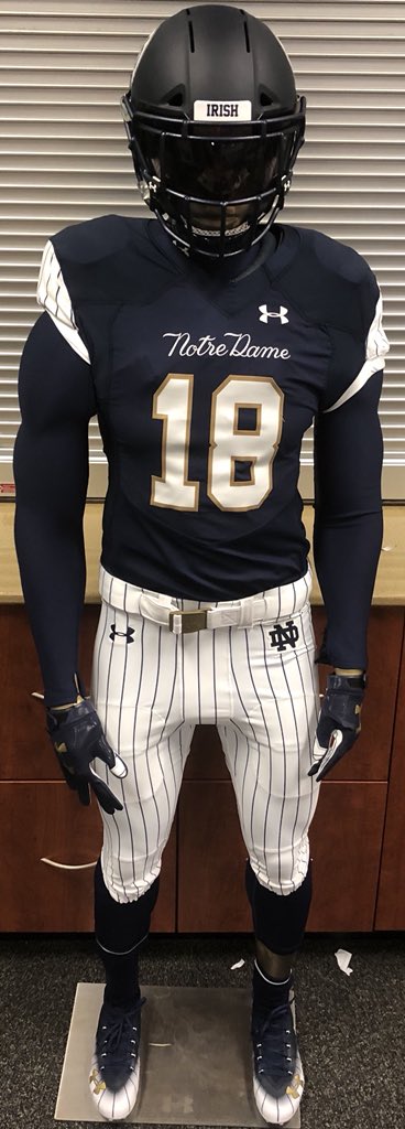
They actually are not bad when you see them as you normally would:
<blockquote class="twitter-tweet" data-lang="en"><p lang="en" dir="ltr">Full look <a href="https://t.co/gSh867wjc9">pic.twitter.com/gSh867wjc9</a></p>— Chris Bacsik (@NDFBEquipment) <a href="https://twitter.com/NDFBEquipment/status/1030149454651969537?ref_src=twsrc%5Etfw">August 16, 2018</a></blockquote>
<script async src="https://platform.twitter.com/widgets.js" charset="utf-8"></script>
PANDFAN
Look Down
- Messages
- 16,770
- Reaction score
- 2,278
To be honest the moment i saw these, i thought they looked terrible...then i just saw a full pic with everything on......pretty sweet looking all together
Plot Twist:
They actually are not bad when you see them as you normally would:
<blockquote class="twitter-tweet" data-lang="en"><p lang="en" dir="ltr">Full look <a href="https://t.co/gSh867wjc9">pic.twitter.com/gSh867wjc9</a></p>— Chris Bacsik (@NDFBEquipment) <a href="https://twitter.com/NDFBEquipment/status/1030149454651969537?ref_src=twsrc%5Etfw">August 16, 2018</a></blockquote>
<script async src="https://platform.twitter.com/widgets.js" charset="utf-8"></script>
exactly
Sherm Sticky
The Prophet
- Messages
- 19,321
- Reaction score
- 1,638
I'm about to neg rep you. The redsox are on pace to be an all time team...give the Yankees a little piece of the pie. And Fenway is a dump!These uni's are absolutely disgusting.
When do they play at Fenway again?
Ndaccountant
Old Hoss
- Messages
- 8,370
- Reaction score
- 5,771
helmet looks black. If it is, why black with the penn state colors?
greyhammer90
the drunk piano player
- Messages
- 16,842
- Reaction score
- 16,131
I'm not a big fan, but I'm not going to burn a mattress over it. My biggest issue, as was brought up by others, is that it looks like a yankee jersey in football form, with no real homage to the actual team that's playing.. Except for the occasional ND that is plastered on, there is nothing to suggest that this is a Notre Dame jersey.
dublinirish
Everestt Gholstonson
- Messages
- 27,335
- Reaction score
- 13,096
if the jersey was just plain pinstripes (an away uni basically) i think i'd like it better
ACamp1900
Counting my ‘bet against ND’ winnings
- Messages
- 48,954
- Reaction score
- 11,239
I'm not a big fan, but I'm not going to burn a mattress over it. My biggest issue, as was brought up by others, is that it looks like a yankee jersey in football form, with no real homage to the actual team that's playing.. Except for the occasional ND that is plastered on, there is nothing to suggest that this is a Notre Dame jersey.
I guess "Notre Dame" being stitched front and center threw me off...
Wild Bill
Well-known member
- Messages
- 5,519
- Reaction score
- 3,267
yup! I always find the UA designs so devoid of creativity honestly. No doubt we will see all their other CFB teams wearing similar uniforms this year minus the pinstripes.
Plank should consider bringing in his alma mater's former S&C coach to provide much needed motivation in their design department.
FightingIrishLover7
All troll, no substance
- Messages
- 12,705
- Reaction score
- 7,517
The jerseys and pants are actually some of my favorites yet for the SS. That being said, idk how you can F up the helmet that badly. Regardless of what color it IS, it LOOKS like black on Navy and it hurts my eyes. On top of that, I think the tiny circle with the logo inside is ridiculously dumb. Is it supposed to be a magic 8-ball?? Should have put a big ND on the side in the same font as the Yankees NY, outlined it in gold and called it a day
Love the jerseys
Helment is a miss.
I think they should have left it gold (maybe a navy monogram)...It would tie with the gold trimmed numbers and better represent the "two" brands. Uniform is very, one branded imo.
Sherm Sticky
The Prophet
- Messages
- 19,321
- Reaction score
- 1,638
I'm not a big fan, but I'm not going to burn a mattress over it. My biggest issue, as was brought up by others, is that it looks like a yankee jersey in football form, with no real homage to the actual team that's playing.. Except for the occasional ND that is plastered on, there is nothing to suggest that this is a Notre Dame jersey.
I see no problem with that. In fact I think that's the best part.
I will say the helmet is to dark though. I think the regular gold helmet would have worked out nicely.
greyhammer90
the drunk piano player
- Messages
- 16,842
- Reaction score
- 16,131
I guess "Notre Dame" being stitched front and center threw me off...
You know what I mean. If you need the uniform to say Notre Dame or for there to be an ND to know its Notre Dame, it's not much of a Notre Dame jersey. The style and visual identity of the uniform is 100% Yankees except for the smaaaall amount of gold around the numbering and on the gloves.
Sherm Sticky
The Prophet
- Messages
- 19,321
- Reaction score
- 1,638
Love the jerseys
Helment is a miss.
I think they should have left it gold (maybe a navy monogram)...It would tie with the gold trimmed numbers and better represent the "two" brands. Uniform is very, one branded imo.
Bingo...
greyhammer90
the drunk piano player
- Messages
- 16,842
- Reaction score
- 16,131
I see no problem with that. In fact I think that's the best part.
I will say the helmet is to dark though. I think the regular gold helmet would have worked out nicely.
That's fine for you as a Yankees fan, but if they're going to do a mashup, I'd like to see an actual mashup of ND and the Yankees. Not "What if the yankees were a football team?"
ACamp1900
Counting my ‘bet against ND’ winnings
- Messages
- 48,954
- Reaction score
- 11,239
You know what I mean. If you need the uniform to say Notre Dame or for there to be an ND to know its Notre Dame, it's not much of a Notre Dame jersey. The style and visual identity of the uniform is 100% Yankees except for the smaaaall amount of gold around the numbering and on the gloves.
It's def more 'Yankee'... no doubt.
- Messages
- 44,619
- Reaction score
- 20,104
To be honest the moment i saw these, i thought they looked terrible...then i just saw a full pic with everything on......pretty sweet looking all together
I've started warming up to them since seeing the full pic. It would be better if the helmet color matched the jersey.
My order of preference
2013
2014
2011
2018
2010
2012
Last edited:
Couldn't they have at least kept the gold helmets?
NDty9
Well-known member
- Messages
- 1,142
- Reaction score
- 638
I've started warming up to them since seeing the full pic. It would be better if the helmet color matched the jersey.
My order of preference
2013
2014
2011
2018
2010
2012
2013 is and ALWAYS will be one of the best uniforms ever created! BOTTOM LINE!
Irish2155
Well-known member
- Messages
- 6,452
- Reaction score
- 1,987
I hate them. Wouldn't be so bad without the pinstripes and the font of Notre Dame on the chest. Pants, arm sleeves and helmet need to be a different ND color without pinstripes.
I usually don't really care about matters like this but this is absolutely the ugliest football uniform I've ever seen. Maybe the ugliest sport uniform I've ever seen.
I usually don't really care about matters like this but this is absolutely the ugliest football uniform I've ever seen. Maybe the ugliest sport uniform I've ever seen.
calvegas04
Well-known member
- Messages
- 11,900
- Reaction score
- 8,487
Not a fan, we can no longer make fun of mich for having a basketball player on their uniform when we are dressing up like a baseball player. The replicas are terrible as well but some of the shirts are cool
ulukinatme
Carr for QB 2026!
- Messages
- 31,523
- Reaction score
- 17,410
You all are haters!
Except for the three or four of you who do like them.
I had an orgasm when I first saw the full SS uniform. My two favorite teams had sex and made a jersey.
I'm ordering my SS 2018 jersey now!
I'm still tingly thinking about the uniforms.
A fool and his money are soon parted.
Wild Bill
Well-known member
- Messages
- 5,519
- Reaction score
- 3,267
Had my fingers crossed for a Holtz inspired uniform celebrating the 30th anniversary of their 88 title. Maybe a caricature of Lou on the uniform, i.e.,
http://designsbyfoush.com/samples/caricatures/LOU-HOLTZ.jpg
https://encrypted-tbn0.gstatic.com/images?q=tbn:ANd9GcSWQ6hKyXJmmOv-KwqjHQR3j1KhFO7D1PTA1QfEfDIzxIyyHnYiGA
and helmet, i.e.,
http://www.helmethut.com/College/Ole%20Miss/MSXXUM7074A%20(2).JPG
"Save Jimmy Johnson's ass for me" written out on the bottom of the cleats. Don't want to be tacky and make it too prominent.
