
pumpdog20
Well-known member
- Messages
- 5,080
- Reaction score
- 3,670
All what? No one is losing their fandom over a jersey. It's alright to comment on things. It is a message board after all.Cheese and rice. All this over a logo on the sleeve?

All what? No one is losing their fandom over a jersey. It's alright to comment on things. It is a message board after all.Cheese and rice. All this over a logo on the sleeve?

Did you go to the X post and see the replies?All what? No one is losing their fandom over a jersey. It's alright to comment on things. It is a message board after all.

This is Merica we call them jerseysI know for soccer kits, you can buy different versions… cheaper ones do not have the patches, while the more expensive do. Not sure if that’s how this will be

Cheese and rice. All this over a logo on the sleeve?


Already tired of hearing "presented by SoFi"

The shoulder logo.


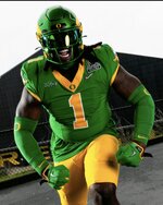

You’re already dipping into Shamrock Series territory removing the ND, I think they should have just made a second change at that point. The whole point of the current green jersey is it’s the blue jersey, but green. Now it’s the blue jersey but green, with a new logo. Just a bland downgrade. Would have liked them to do something like Oregon does at this point for their spoof of ND jerseys:
View attachment 3064223
View attachment 3064222
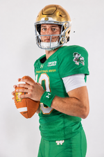


Same. Anything but the double green imo.I like them with gold pants better, but overall they are fine.
Bring back the gold hooker pants!I like them with gold pants better, but overall they are fine.
LOVE those jerseys but my only gripe is no gold outline on the numbers (navy blue outline instead).I like the green jerseys with gold pants, but we haven’t gotten that for a while.
I REALLY want some Sugar Bowl white jerseys with green numbers sometime soon.

Yeah the kelly green is not a good look. Love the darker green they used for the 2005 USC jerseys (gold numbers with white outline) and the 1998 Gator Bowl jerseys (white numbers with gold outline). They also used the same shade of green for the 1994 Fiesta Bowl (white numbers with navy blue outline).My take is that the green jerseys are almost universally ugly. The kelly green uniform was cool exactly one time in 1977 because it was so unexpected and because we won. The best looking green uniform overall was 05 but we lost that game so unfortunately it goes in the fire pit.
I actually think the new leprechauns for each sport are awesome.

My take is that the green jerseys are almost universally ugly. The kelly green uniform was cool exactly one time in 1977 because it was so unexpected and because we won. The best looking green uniform overall was 05 but we lost that game so unfortunately it goes in the fire pit.

My friends call me Buster.Of course you do Bilbo.

Uncultured swine ! 😉This is Merica we call them jerseys

Was that the Trojan Horse game?My take is that the green jerseys are almost universally ugly. The kelly green uniform was cool exactly one time in 1977 because it was so unexpected and because we won. The best looking green uniform overall was 05 but we lost that game so unfortunately it goes in the fire pit.


