
calvegas04
Well-known member
- Messages
- 13,002
- Reaction score
- 9,884
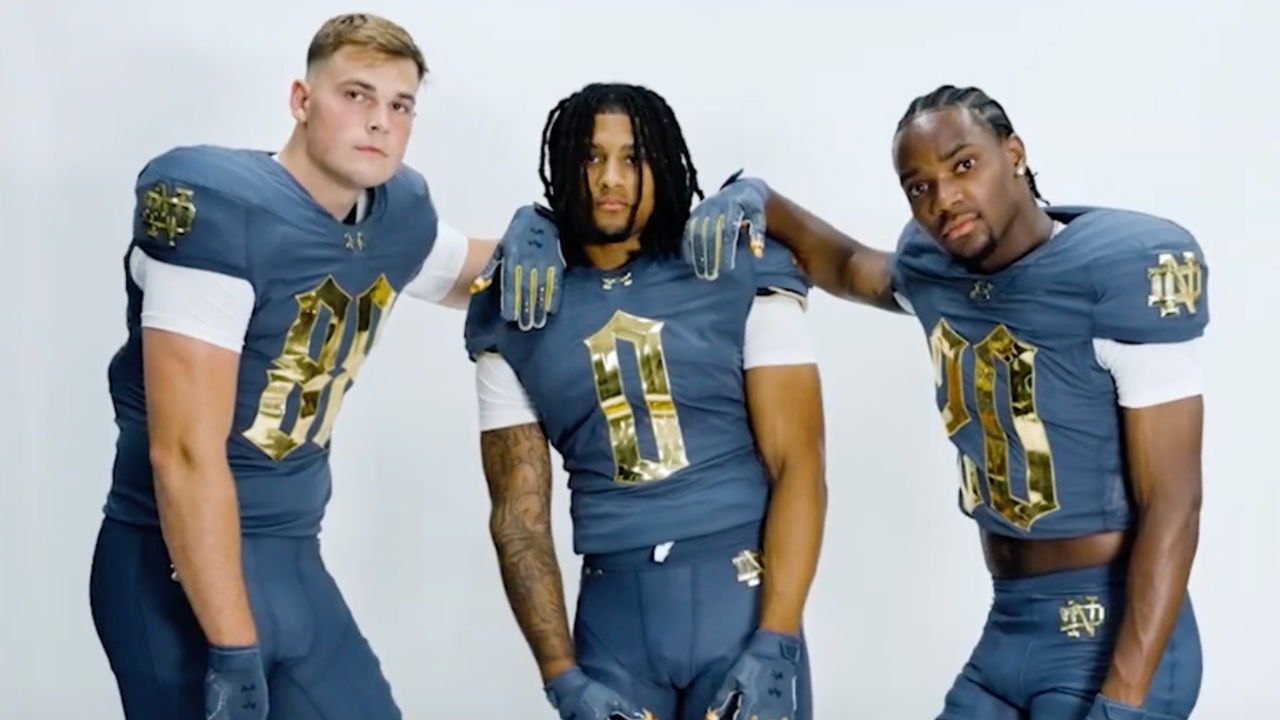
All the rest of the SS gear is released


This is always an ugly look, I'm glad they didn't touch the helmetthought they might go with some sort of leather style throwback helmet ala Packers, Washington, Illinois etc


Ehh...didn't they just have a similar look.
Missed opportunity to go with the retro Golden Boy green for a crossover with the Packers. Under Armor sucks.

Call me crazy…I think those look badass…
They’re similar to the Gotham jerseys vs Army a couple years ago, but the numerals are cleaner and that shade of blue in NYC was more grey if I recall. I think these are pretty clean.

These are gonna look terrible on Jimmy3putt
Correct. Blue-Grey for the Four Horsemen and the numerals were “gothic” for NYC.Was I wrong thinking that blue/grey uniform had something to do with the four horsemen vs Army in 1924 or did I just make that up? I really liked those and I also think this years look is real nice.



I've always thought Ohio State vs. Michigan should be doing it. Like USC vs. UCLA wear their version of blue and red.red v blue on the field. don't see that often
yeah the chrome looking stuff is boring now, Oregon started it in 2012. The problem with UA and even Adidas is that they are always behind Nike on everything newLook like Louisville
Not since Gettysburg....red v blue on the field. don't see that often

Or in South Central LA......Not since Gettysburg....


