What is the "uniform surprise"?

IHateMarkMay

IHateDavidPollackToo
Messages
3,902
Reaction score
1,020
I think the old pants would really clash with the shininess of the helmet. It's one of those things where you have black slacks and a black blazer but they are different blacks. If it's close, it looks like **** unless it is spot on. I think the more yellow look good with the helmet.
 
B

Buster Bluth

Guest
I think the old pants would really clash with the shininess of the helmet. It's one of those things where you have black slacks and a black blazer but they are different blacks. If it's close, it looks like **** unless it is spot on. I think the more yellow look good with the helmet.

New:
20120922_tjg_sc5_417_extra_large_huge.jpg


Old:
Prince+Shembo+USC+v+Notre+Dame+w0BNuto4oo-l.jpg


New:
hi-res-hi-res-152052247_crop_exact.jpg


Old:
bilde
 
B

Buster Bluth

Guest
For 2013's Shamrock Series I'd love to see the madona blues rendition of the uniform. It'd look sorta like this:

47194_4718552768232_379629211_n.jpg
 

NDTH91

Well-known member
Messages
1,092
Reaction score
204
For 2013's Shamrock Series I'd love to see the madona blues rendition of the uniform. It'd look sorta like this:

47194_4718552768232_379629211_n.jpg

I like.... I like a lot.

EDIT: btw you absolutely nailed the color on this. Not too light, and JUST dark enough. Well done!
 

BurningRiver

ND 2017
Messages
1,451
Reaction score
242
I don't know if this has been a topic of discussion yet but whoever made the decision to put captain patches on the uniforms hit an absolute home run.
 

choo choo

crusty veteran
Messages
1,019
Reaction score
543
I'd rather have the base layer underneath the home jersey be white, and for the road jersey be blue. I've always thought this:

jimmy-clausen-top11-full.jpg


looks better than this:

Notre-Dame-QB-Rees-enters-not-guilty-plea-9T1GERPM-x-large.jpg


And not just because I'd give my left nut for Clausen to be our QB again.

haha id pitch in my right one
 

peoriairish

New member
Messages
4,145
Reaction score
350
Found this video of how the helmets are painted. They look pretty bad@ss.

<iframe width="560" height="315" src="http://www.youtube.com/embed/-0ptopBYfjM" frameborder="0" allowfullscreen></iframe>
 

yankeeND

!!!!!!!!!!!!!
Messages
4,607
Reaction score
255
That was pretty sweet! I love the uni's! I know a lot of people don't but most people that don't hate us anyways or are fans that are traditionalists.
 

arrowryan

Well-known member
Messages
14,715
Reaction score
8,916
For those of you who don't like the jersey, remember that this jersey is trying to impress high school and college kids (which it does). It's not trying to impress 40 year old dads
 

Kak7304

Well-known member
Messages
2,068
Reaction score
361
For those of you who don't like the jersey, remember that this jersey is trying to impress high school and college kids (which it does). It's not trying to impress 40 year old dads

Exactly. When BK went on college gameday this morning, he flat out said it was to entice recruits.
 

Irish#1

Livin' Your Dream!
Staff member
Messages
44,577
Reaction score
20,027
Yeah I like the new, darker pants much more with the white away jerseys, but I think the old, lighter pants look better with our blue home jerseys.

I guess it depends on your age and perspective. To me the "old" lighter pants are actually the newer pants and the "new" darker pants are the original. LOL

As far as the "Madonna" color, I don't like it at all. Reminds me too much of the Faust era.
 

kmoose

Banned
Messages
10,298
Reaction score
1,181
For those of you who don't like the jersey, remember that this jersey is trying to impress high school and college kids (which it does). It's not trying to impress 40 year old dads

Maybe that is part of the problem with these kids. Everyone is spending all this time trying to impress them. And we wonder why so many college players have this sense of entitlement? It used to be an honor and privilege, to play football for Notre Dame. Maybe we should be trying to get back to that attitude?

For the record; I have no problems with the jerseys, the pants, the socks, or the shoes. I think the helmets are way overdone, and went way too far away from the iconic golden domes.
 

GoIrish41

Paterfamilius
Messages
9,929
Reaction score
2,119
the helmets are stupid. the rest of the uniforms have been around for a while ... Pitt was wearing them.
 

Jimmy3Putt

KooL
Messages
5,769
Reaction score
6,684
I saw this on another site.
Not sure if everyone here has seen so I posted.
Some might get a kick out of it, others might get sent over the edge.
I think it's pretty creative:


shamerockseries.jpg
 

DuffHouse12

New member
Messages
233
Reaction score
5
very creative - but the helmets aren't 50/50. i feel this picture would look better if it were better proportioned.

also - great photo quality on the rest of the building makes it not really that offensive.
 

OCIrish

Fukk Michigan
Messages
3,280
Reaction score
218
For those of you who don't like the jersey, remember that this jersey is trying to impress high school and college kids (which it does). It's not trying to impress 40 year old dads

Watch it BUB.....I'm gonna be 40 in just under 3 years, and I LOVED the unis tonight.
 

ShamrockOnHelmet

Refreshman
Messages
2,745
Reaction score
1,750
Loved the Unis and the Helmets tonight. Looked even better than I expected. Bravo Swarbrick and Kelly, great moves.
 

Jimmy3Putt

KooL
Messages
5,769
Reaction score
6,684
I really liked the color of the gold on the numbers.

The pants seemed to match up better then the normal ones too.
 

NDdomer2

Local Sports vBookie
Messages
17,050
Reaction score
3,875
I think they doinked the leprechauns. Some were having almost straight down.
 

dre1919

www.andrewsloan.com
Messages
1,042
Reaction score
70
Well, I'm an artist and graphic designer by trade and so I am all for creativity and interesting developments with uniform stuff. But, with that having been said, I think the ones they designed for this Miami game are terrible. Here's why:

1. Never been a fan of the "This side shows one uniform, the other shows another" gimmick. It's goofy, and is going to look as dated as a 90's style haircut in no time flat.

2. The gold on the pants in this Miami game is much better than the current ones we use (which got too yellow for some odd reason), but KMOOSE is right...the helmet is wildly overdone. It's like they tried to figure out how to outdo themselves AS THEY WERE DOING THE HELMET. What? Oh this will look cool! No wait, let's add this! Oh, we gotta have this! Etc.

3. The numbers suck. Looks like Missouri or any generic C-USA type team trying to look "futuristic". See what I did there? I didn't use block letters so we're more trendy!

4. The swirly gold on the helmet is rather cheesy, but that could be from past memories for me. I worked in a sign shop as one of my first jobs out of college and they had that exact look available in vinyl sticker back then (1999). But, it never lasted, peeled off, and was almost always a gimmicky sticker type on race cars. Yuck.

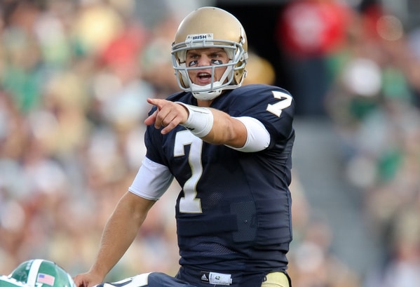
5. Notre Dame's look is classy and timeless, but if you want to do something different with the unis, cool. Use one of TWO very cool looking logos we currently barely or don't use...the interlocking ND (just brought back for the sleeve) and the fighting Irishman in full color. Not this goofy slanted white guy. Hell, do a gold helmet with either of these on the sides it would look great. Personally, I'd be all for a gold helmet with green shamrocks as pride stickers. That's an awesome tradition too few teams even do anymore.

6. What I would really like is a gold metal flake helmet (not the mirrored one we currently use or this pitina looking side), jerseys with the "ND" on the sleeve, normal numbers, correct gold pants (not the yellowish gold we have arrived at for some inane reason), and have a green shamrock on the pant (circa the Bob Davie era). Plus, long blue socks and the gloves that form the Irishman logo to top it off That would look slick, classy, and well put together.
 
Last edited:
Top