Easton Pa ND Fan
New member
- Messages
- 700
- Reaction score
- 48
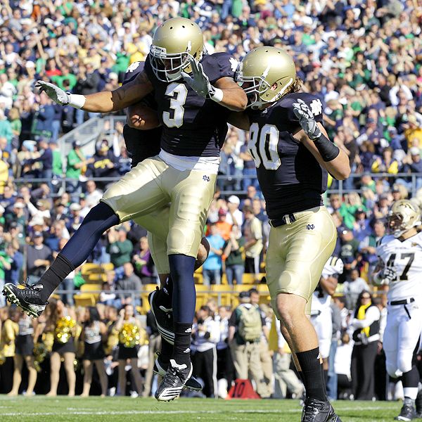
1. The new jerseys look darker. The Irish appear
to be wearing Army colors (Black and Gold). The
jerseys should be a darker shade of blue but NOT
navy blue (ND's original colors were blue and Gold).
2. The shoulder logos look like crap. No distinct-
ive and interlocking "ND" like in earlier editions.
Also the iron-on effect seems to "muddy" the logo.
3. The jerseys numbers are not as readily visible
as on earlier jerseys. I don't know whether the
proportions are out of kilter or what.
4. My wife says, and she is right, that the uni-
forms appear to small for the bodies and the arm-
pits show. YUCK! It looks like they ran out of
the material for the sleeves. They are somehow
out of proportion.
5. Remove or shrink the Adidas logo from the front
of the jersey, put the shamrock back in the "v"
of the collar and use gold as a collar trim.
Otherwise:
<FONT FACE="Algerian" SIZE="8"><FONT COLOR="#00BF60">G</FONT><FONT COLOR="#00BF60">o</FONT><FONT COLOR="#00BF60"> </FONT><FONT COLOR="#0060BF">I</FONT><FONT COLOR="#0060BF">r</FONT><FONT COLOR="#0060BF">i</FONT><FONT COLOR="#0060BF">s</FONT><FONT COLOR="#0060BF">h</FONT><FONT COLOR="#0060BF"> </FONT><FONT COLOR="#EFD373">!</FONT><FONT COLOR="#EFD373">!</FONT><BR><FONT COLOR="#EFD373"></FONT><FONT COLOR="#EFD373"></FONT></FONT>
Last edited: